Nonprofit organizational chart: Build transparent governance and boost grants
Discover a clear Nonprofit organizational chart to define governance, enhance transparency, and win grants. Explore practical templates and tips.

Abdifatah Ali
Co-Founder
A nonprofit organizational chart is much more than a list of names and titles. Think of it as the visual blueprint for your mission's success. This single document clarifies reporting structures, defines who's responsible for what, and shows potential funders exactly how your team turns a powerful vision into on-the-ground reality. It’s a vital tool for both internal clarity and external credibility.
Your Org Chart Is a Strategic Tool, Not a Formality
Let's be honest. For many, creating an organizational chart feels like a stuffy corporate chore—a box-checking exercise straight out of a business school textbook. But what if you started seeing it as one of your most powerful strategic assets? For a nonprofit, the org chart is so much more than a simple diagram of boxes and lines. It's a dynamic map that tells the story of how your people create real-world impact.
When designed with intention, a good chart provides immediate clarity. It streamlines communication and helps prevent the kind of role confusion that leads to burnout on so many mission-driven teams. When everyone knows their role and who to turn to for a final decision, internal friction drops, and your team’s focus sharpens.
Beyond a Simple Hierarchy
In the world of lean nonprofits where everyone wears multiple hats, a clear chart isn't a luxury—it’s essential for survival. It’s a practical tool for managing workloads, spotting capacity gaps before they become crises, and planning for sustainable growth. Don't think of it as a rigid, static hierarchy. Instead, see it as a flexible guide that reflects your current reality while paving the way for the future.
This document also does some heavy lifting with funders. A well-crafted chart powerfully demonstrates your organization's capacity and stability, answering critical questions before they’re even asked:
- Who is truly responsible for financial oversight?
- How are programs actually managed and evaluated?
- Is there a clear line of leadership for executing this grant-funded project?
A strong organizational chart doesn’t just show who reports to whom. It signals to grantmakers that you are a well-managed, trustworthy, and capable partner ready to handle their investment responsibly.
A Foundation for Growth and Clarity
Ultimately, the process of creating or updating your chart forces crucial conversations about structure, strategy, and accountability. It’s a chance to gut-check that your human resources are aimed squarely at your mission objectives.
This isn't about creating bureaucracy for its own sake. It’s about building a strong foundation that frees your team to focus on what truly matters—serving your community and making a difference. So, forget the formality. It's time to embrace the org chart as the strategic asset it truly is.
Drawing the Line Between Governance and Management
One of the quickest ways a nonprofit can get into trouble is by blurring the critical line between governance and management. It’s an easy mistake to make. Everyone is passionate about the mission, but the roles the Board of Directors and the staff play are fundamentally different.
A well-designed org chart doesn’t just show who reports to whom; it makes this crucial distinction visually obvious, preventing a ton of confusion and operational friction down the road.
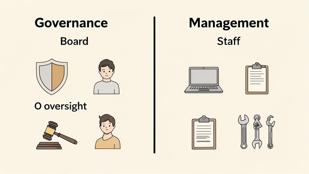
Governance is the high-level, strategic oversight provided by your Board. Think of them as the guardians of the mission, focused on the big-picture "what" and "why." Their job is to set the long-term vision, keep the organization financially sound, and, most importantly, hire and support the Executive Director.
Management, on the other hand, is all about the "how." This is the world of your Executive Director and their staff. They are responsible for the day-to-day operations, running the programs, managing the budget, and actually doing the work that brings the board's strategic vision to life.
A Common Pitfall: The Overly-Engaged Board Member
Let’s walk through a real-world example. Imagine your nonprofit runs an after-school tutoring program. A new board member, a retired teacher with a huge passion for literacy, starts getting very involved. They begin visiting the center a few times a week, giving direct feedback to tutors on their teaching style and suggesting curriculum changes on the spot.
While their heart is in the right place, this is a classic governance-management mix-up. This behavior completely undermines the authority of the Program Manager, confuses the staff about who's in charge, and pulls the board member away from their real job: strategic oversight.
I've always said that a nonprofit’s strength lies in a partnership where the board steers the ship (governance) and the staff rows it (management). When board members grab an oar and start rowing, the ship just goes in circles.
In a healthy structure, that passionate board member would channel their energy differently. They would review program outcome reports at board meetings, ask sharp, strategic questions about the program’s impact, and help approve the annual budget. They would govern, not manage.
Governance vs Management Responsibilities in a Nonprofit
To make this separation absolutely clear, it helps to see the roles laid out side-by-side. The board’s focus should always be on foresight and oversight. The staff’s focus is on execution and administration. This division of labor isn't just about efficiency; it's a critical component of accountability and something that savvy funders always look for as a sign of a well-run organization.
This table breaks down those distinct duties:
Having this clear separation of duties prevents micromanagement and truly empowers your staff to do their best work. For organizations looking to strengthen their financial oversight, bringing in expert financial leadership from Fractional CFO Services can be an effective way to support both the board and management.
Ultimately, your org chart is the first and best place to visually cement these essential boundaries. It creates a foundation of trust and clarity that is absolutely vital for achieving your mission. This same clarity is essential for avoiding issues like self-dealing, which is why it's so important to also create a strong conflict of interest policy for your nonprofit.
Mapping Your Mission-Critical Functions
Alright, let's get down to brass tacks and start building the real substance of your org chart. This isn't just about drawing boxes and connecting them with lines; it's about creating a visual map of how your mission actually comes to life day in and day out. We want a chart that reflects how work really gets done, not some theoretical hierarchy that looks good on paper but doesn't match reality.
So many organizations make the mistake of starting at the top with the Executive Director and working their way down. I've found it’s far more effective to flip that script. Start with the work itself. Before you think about titles, think about your core programs—the services that are the very reason you exist.
Start with Your Programs
Your programs are the heart of your organization. They're the engine. Whether you're running an after-school tutoring service, a community food bank, or an environmental advocacy campaign, these are your "products," and they need to be front and center.
When you begin mapping, try to think in terms of functional areas first, not individual people. This simple shift helps clarify what needs to happen, regardless of who is currently doing it.
- List each distinct program. If you have a "Youth Mentorship Program" and a "Senior Wellness Program," put them down as separate areas.
- What are the key roles in each? Think about who handles outreach and recruitment. Who actually delivers the service (the mentors, the case managers)? And who is tracking the impact and gathering the data?
- Group related tasks. These clusters of tasks are what will eventually become the roles on your chart, like "Program Coordinator" or "Outreach Specialist."
Taking this "program-first" approach anchors your entire organizational structure to your mission. It also gives you a crystal-clear picture of your frontline operations, which is precisely what savvy funders want to see.
Layer in Your Essential Support Functions
Once you have a solid map of your programs, it's time to layer in the support functions that make all that good work possible. These are the internal operations, the infrastructure that holds everything up. Without a strong foundation here, your programs simply can't run effectively or sustainably.
Typically, these key support functions include:
- Fundraising & Development: Everything from grant writing and individual donor relations to event planning and corporate sponsorships.
- Finance & Administration: This is your bookkeeping, budget management, HR, and the general nuts and bolts of office operations.
- Marketing & Communications: Think social media, website updates, PR, and creating all those program flyers and brochures.
- Volunteer Management: For so many of us, this is a massive piece of the puzzle. It covers recruitment, training, scheduling, and—critically—volunteer appreciation.
Think of it this way: your programs are the "front of house," and your support functions are the "back of house." You absolutely need both working in harmony to put on a successful show, and your org chart should reflect that partnership.
Reflecting the Reality of Lean Teams
As you start mapping this all out, you'll likely run into a very familiar nonprofit reality: one person is wearing multiple hats and filling several boxes on the chart. Your Development Director might also be your only Grant Writer. Your Program Manager might double as the de facto Volunteer Coordinator. Don't worry—that’s completely normal.
The key is to create a chart that reflects your current reality, not some idealized future state. This has never been more important, especially with the staffing shortages that have hit our sector so hard. In 2023, a staggering 33.8% of nonprofits reported job vacancy rates over 20%, forcing many to operate with skeleton crews. This often means managers are juggling multiple critical roles, a situation made even tougher when 72.2% of nonprofits say salary competition is their biggest barrier to hiring. You can see more of this in the 2023 nonprofit workforce survey.
Your org chart needs to be honest about this. You can use dotted lines or simply list multiple functional responsibilities under a single role to show how tasks are currently spread out. This kind of honest self-assessment does two things: it clarifies workloads for your internal team and gives you a flexible, realistic roadmap for future hiring when the funding comes through.
Finding the Right Structure for Your Nonprofit's Size
Let's get one thing straight: there's no such thing as a one-size-fits-all organizational chart. The perfect structure for your nonprofit is the one that actually works for your team, your budget, and your mission. Now that we've covered the basics of governance versus management, it's time to get practical and look at what these structures look like in the real world.
This is especially true when you consider the financial reality for most nonprofits. Over 70% of all U.S. nonprofits—that's more than a million organizations—are running on less than $50,000 a year. You can explore the full 2023 data on nonprofit revenues to see the breakdown.
These numbers aren't just statistics; they dictate structure. They mean the Executive Director is likely the chief fundraiser, program manager, and head of operations all rolled into one, backed by a tiny but mighty team and a crew of passionate volunteers.
The Flat Structure for Small and Emerging Nonprofits
If you're just starting out or running a lean, volunteer-driven operation, the flat organizational chart is your best friend. In this setup, you have very few, if any, layers of management between the Executive Director and everyone else doing the work.
Think of a five-person team running a new community garden. A flat structure lets information flow freely, making the group nimble and quick to adapt. Everyone has a direct line to the leader, which builds a strong sense of shared purpose.
But this model isn't built to last forever. As you grow, you'll start to feel the pain points:
- Who does what? With no clear departments, roles can start to overlap and become confusing.
- The ED bottleneck. The Executive Director can quickly become a bottleneck, buried under direct reports and daily questions.
- Nowhere to go. Staff might feel stuck, with no clear ladder to climb for their careers.
The Functional Structure for Mid-Sized Organizations
Once your nonprofit hits a certain stride—more staff, more complexity—it's time to consider a functional organizational chart. This is a more traditional, hierarchical model where you group people by their specific job function.
You'll start to see distinct departments taking shape, like:
- Programs
- Development (Fundraising)
- Finance & Administration
- Marketing & Communications
Each department has a director who reports to the Executive Director. This brings clarity to roles, deepens expertise within each team, and gives you a solid framework to build on. A mid-sized food bank is a perfect example; you'd have one team handling warehouse logistics, another coordinating volunteers, and a third focused entirely on fundraising. If you're looking for more ideas on how to group these roles, check out different options for your nonprofit organizational structure.
A functional structure brings order to complexity. It allows specialists to focus on what they do best, whether that's writing grants or running programs, which ultimately strengthens the entire organization.
The Programmatic Structure for Large Nonprofits
For large, multifaceted nonprofits juggling several complex programs, a programmatic (or divisional) structure is often the answer. Here, the organization is built around its individual programs, services, or even geographic regions.
Picture a large international aid organization. It might have separate divisions for "Disaster Response," "Water & Sanitation," and "Global Health." Each of these divisions acts almost like a mini-organization with its own director, budget, and dedicated team, all reporting up to the CEO.
This infographic really captures how all the different functions work together to serve the organization's core purpose.
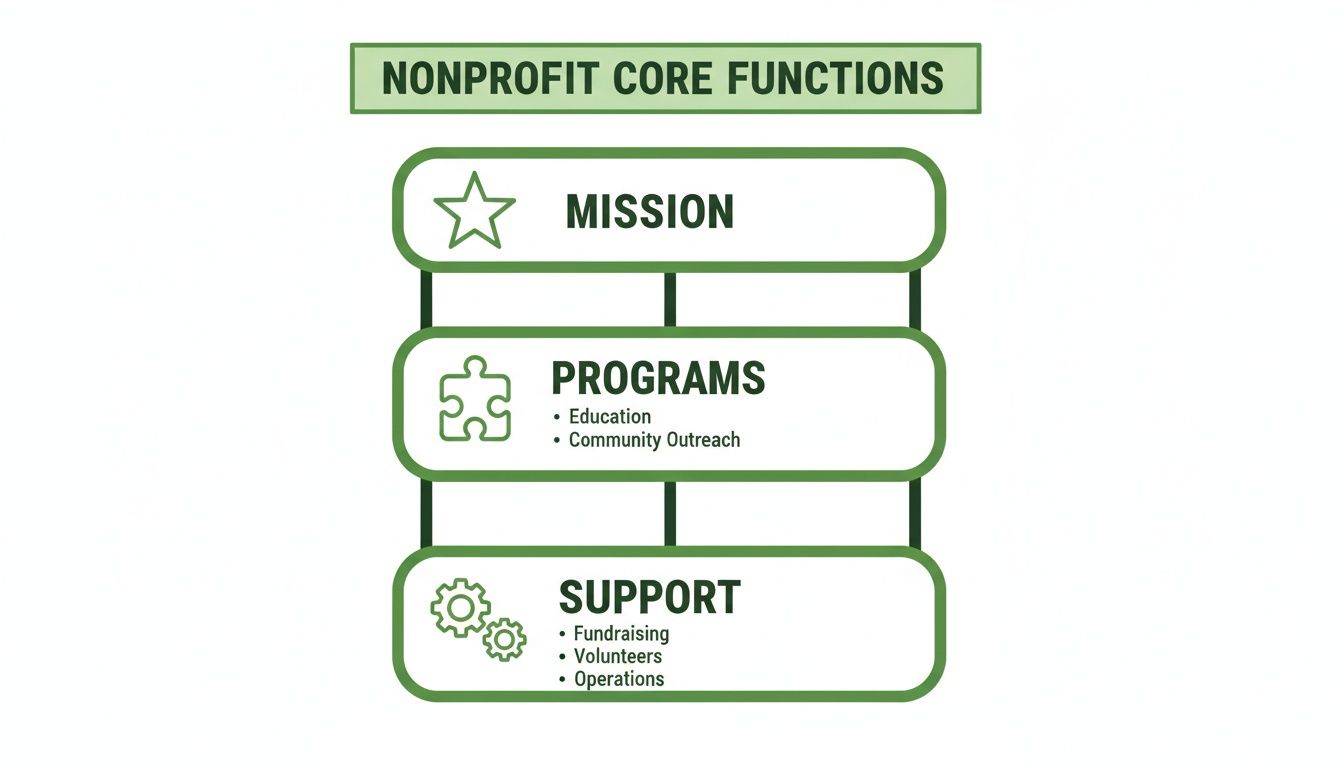
As you can see, the support functions are the foundation—the engine room—that allows the programs to succeed and fulfill the mission. This approach gives program leaders the autonomy to be highly responsive and specialized. The risk? You can accidentally create silos, where teams become disconnected and don't share resources effectively. The key is finding the right balance between clarity, flexibility, and a realistic view of what your organization can handle right now.
Using Your Org Chart to Win Grants and Ensure Compliance
Think of your nonprofit's organizational chart as more than just an internal diagram. It's a secret weapon in your fundraising and compliance efforts. Grantmakers aren't just funding a good idea; they're investing in an organization's ability to actually do the work. A clear, professional org chart is often the quickest way to show them you have the right team and structure to manage their funds responsibly.
Imagine a foundation officer sifting through dozens of proposals. They need to see, almost instantly, that you’re a stable, well-run, and trustworthy partner. Your org chart can answer critical questions about project leadership, financial oversight, and staffing capacity before they even have to read a full page of text.
Strengthening Your Grant Proposals
Tucking a simplified version of your org chart into a grant proposal appendix is a savvy move. It’s a visual shorthand for professionalism and strategic thinking. It tells the funder that you've thought seriously about the human resources required to deliver on your promises.
For a specific project, you can even create a custom chart highlighting only the key players. This is incredibly effective.
- Project Manager: Instantly shows who is accountable for the grant’s success.
- Key Program Staff: Identifies the frontline team who will be delivering the services.
- Financial Oversight: Pinpoints the Finance Manager or bookkeeper responsible for tracking every dollar, signaling strong fiscal controls.
A grant proposal with a clear organizational chart is like a resume with a stellar work history—it builds immediate confidence. It tells the funder, "We have the team, we have the structure, and we are ready to deliver."
This visual proof of capacity has never been more important. Many nonprofits have focused on efficiency to build financial resilience, with leaders reporting balanced budgets or even surpluses despite economic pressures. This stability is often driven by a focus on key revenue streams like foundation grants. Research shows how this has influenced a move toward leaner, more effective team structures that funders want to see.
Bolstering Internal Compliance and Reporting
Beyond fundraising, your org chart is a cornerstone of internal compliance. It establishes clear lines of authority and responsibility—the bedrock of good governance. When it comes to financial and legal reporting, ambiguity is your worst enemy. A good chart eliminates any confusion about who owns which critical task.
Think about these common compliance situations:
- Financial Audits: The chart immediately points to the Finance Director or CFO as the main contact for auditors, making the whole process smoother.
- Grant Reporting: It shows the Program Manager is on the hook for impact data, while the Development Director is responsible for submitting the final report.
- Payroll & HR: It clarifies that the Operations Manager is accountable for staying on top of employment laws.
By visually defining these roles, the org chart acts as a proactive risk management tool. It helps prevent crucial tasks from falling through the cracks and ensures deadlines for government filings or funder reports are hit. This clarity is the first step in implementing systems like dedicated governance, risk, and compliance software, which can be a game-changer.
To dive deeper, check out our guide to effective grant management for nonprofits.
Common Questions About Nonprofit Org Charts
Even with the best templates in hand, turning strategy into a clear organizational chart brings up real-world questions. I've seen leaders wrestle with the same challenges time and again, from keeping the chart from becoming obsolete to figuring out where—or if—volunteers fit in. Let's dig into some of those common sticking points.
How Often Should We Update Our Organizational Chart?
Think of your org chart as a living document, not something you carve in stone. It's a snapshot of how your team functions right now. As your organization grows and changes, the chart has to keep up.
At an absolute minimum, you should be giving it a thorough review at least once a year, usually alongside your annual strategic planning. This makes sure the structure you have in place actually supports the goals you're setting for the year ahead.
But an annual review is just the baseline. You need to pull it out and make immediate updates after any major shift. These are the big triggers:
- Hiring or promoting someone into a key leadership position.
- Launching a new program that brings in new staff or shuffles reporting lines.
- Restructuring a department.
- Losing a key leader, which can leave a temporary vacuum.
For smaller, scrappier nonprofits that are growing quickly, a quarterly check-in is probably a better rhythm. The whole point is to keep it current. An outdated chart doesn't just look sloppy; it creates genuine confusion about who does what and gives funders a completely wrong impression of your organization.
What Is the Best Format for a Nonprofit Org Chart?
Honestly, the "best" format is whichever one is the clearest and easiest for your team and partners to understand. While there are some creative designs out there, clarity should always win out over creativity.
A traditional top-down hierarchical chart is the standard for a reason: everyone gets it instantly. It’s perfect for showing clear lines of authority and making it obvious who is accountable to whom.
That said, some nonprofits find that a traditional chart feels too rigid for their collaborative culture. A flat or circular chart, for example, can be a great way to visually de-emphasize hierarchy and put the focus on teamwork. If you go this route, just make sure it’s still simple enough to understand in a five-second glance.
No matter which format you land on, make readability your number one priority. Stick to simple job titles, use consistent formatting, and don't be afraid of white space. A clean chart is a powerful communication tool.
For practical purposes, a simple PDF is perfect for sharing externally in grant proposals or with partners. Internally, you might get more mileage out of an interactive digital chart using org chart software. These tools often let you link each person's box to their full job description or contact info, transforming a static diagram into a dynamic team directory.
Should Volunteers Be Included on the Org Chart?
This is a great question, and the answer comes down to the volunteer's role and level of responsibility. It’s almost always a bad idea to try and list every single volunteer on your chart—it would be a cluttered mess that’s impossible to keep updated.
Instead, a much cleaner approach is to have a single box labeled something like "Program Volunteers" that reports to the appropriate staff member (e.g., the Volunteer Coordinator). This shows your capacity to leverage community support without overcomplicating the picture.
The major exception here is for volunteers who hold significant, formal leadership roles. If a volunteer chairs a committee with real decision-making power or leads a major project, putting them on the chart is a smart move. It clarifies their authority and formally recognizes their contribution.
You can handle this a couple of ways:
- Create a "Volunteer Leadership" branch that reports to the relevant staff manager.
- Use a different color or a dashed-line box for volunteer roles to distinguish them from paid staff.
Including these key volunteers makes it clear where they fit and gives them the official acknowledgment they deserve.
How Do We Show Dotted Line Reporting?
In the nonprofit world, cross-functional work isn't just a buzzword—it's how we get things done. This reality often creates situations where an employee has more than one boss, in a sense. The classic example is a grant writer who reports directly to the Development Director for performance reviews but works hand-in-glove with the Program Director to get grant proposals out the door.
This is exactly what dotted-line reporting was made for.
On the chart, a solid line shows a direct, formal reporting relationship. That’s the person who signs the timesheet and does the annual review. A dotted line, on the other hand, signals an important secondary relationship built around a specific project, function, or collaborative effort.
It's a simple visual cue that says, "This person has a strong accountability to this manager for certain tasks, but that manager isn't their direct supervisor." It’s the perfect way to capture the matrix-style teamwork that is so common—and so essential—in our sector.
Ready to build a stronger, more fundable organization? Fundsprout is an AI-powered platform designed to help you find the right grants, craft winning proposals, and manage compliance with ease. Discover how our tools can streamline your entire grant lifecycle, from prospect research to final reporting. Learn more at https://www.fundsprout.ai.
Try 14 days free
Get started with Fundsprout so you can focus on what really matters.