10 Fundraiser Flyer Ideas for 2026 That Drive Donations
Discover 10 powerful fundraiser flyer ideas with examples to boost donations. Get practical tips for print, digital, and event flyers that get results.

Abdifatah Ali
Co-Founder
More Than Paper: Flyers That Fund Your Mission
You’ve poured hours into planning a campaign, lined up your donation page, drafted the emails, maybe even booked the event space. Then the flyer gets thrown together at the end. A headline, a logo, a stock photo, a QR code, done. That’s where results start slipping.
A strong flyer isn’t decoration. It’s a field tool. It helps a parent decide to attend, a local business decide to sponsor, a donor decide to give now instead of later, and a volunteer decide to sign up instead of scrolling past. In practice, flyers still matter because people remember them. Venngage reports that 89% of people remember receiving a flyer and nearly 8 in 10 read, share, or keep it in its analysis of direct mail marketing effectiveness. That’s why smart nonprofits don’t treat flyer design as a side task. They build it into the fundraising strategy.
That also means your flyer should match your audience, your campaign moment, and your backend systems. A sponsorship flyer should look different from a crisis appeal. A volunteer flyer should collect different information than a year-end donor piece. And if your team is refining visual identity across channels, graphic design for branding makes a difference. Consistency makes your outreach easier to recognize and easier to trust.
Below are 10 fundraiser flyer ideas that are effective in practice, with the trade-offs that matter when your staff is small, your timeline is short, and every piece needs to pull its weight.
1. Matching Gift Challenge Flyer
A matching gift flyer works best when you need urgency without sounding desperate. It gives donors a simple reason to act now. Their gift doesn’t just help. It gets multiplied.
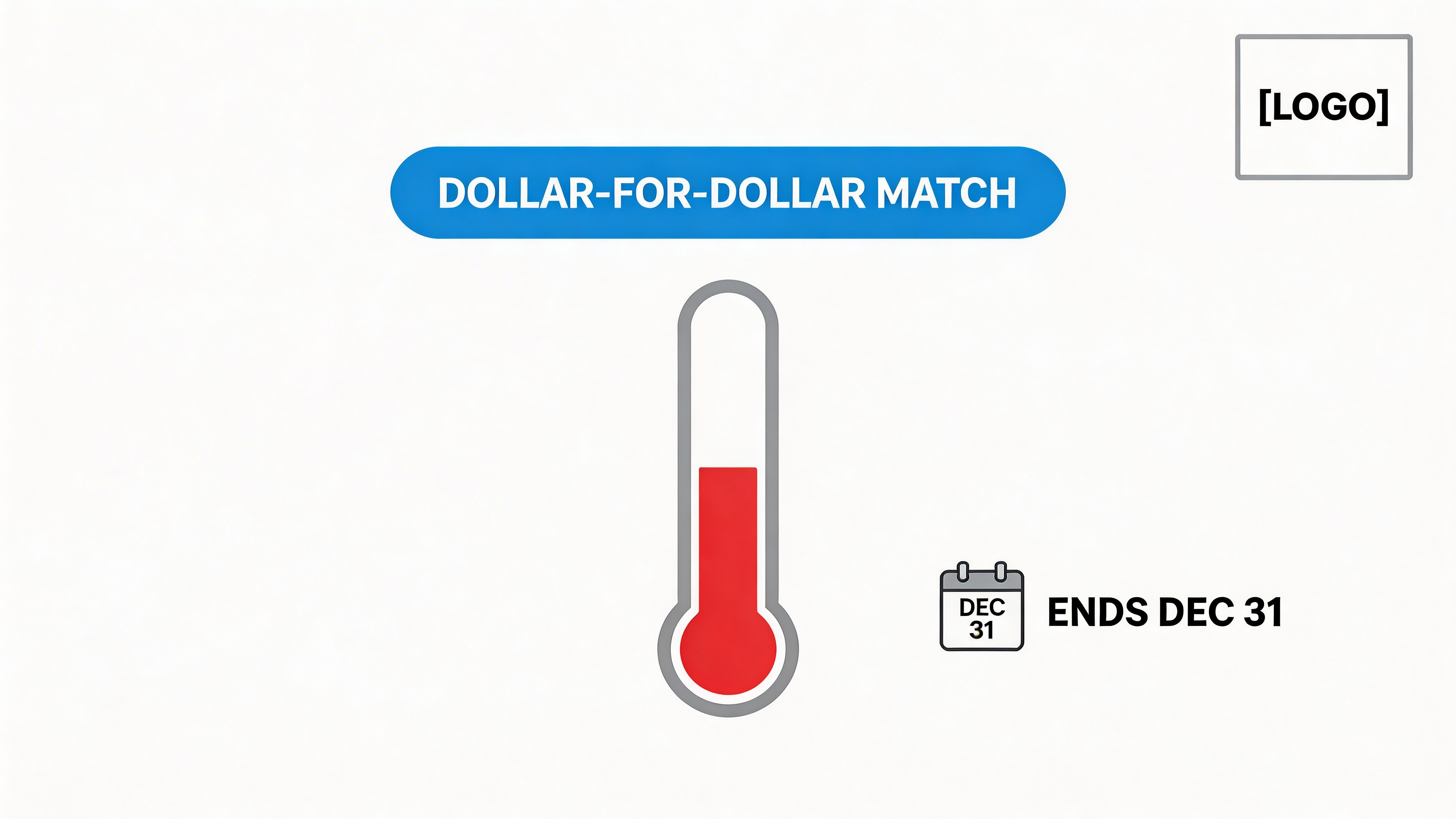
Put the match at the top, not buried in body copy. If a business owner, family foundation, or long-time donor has pledged to match contributions, the flyer should say that in the first glance. The second thing a reader should see is the deadline.
What makes it work
Visual progress matters here. Givebutter notes that visual fundraising goal trackers such as thermometers or progress maps can increase donations by up to 35% in nonprofit campaigns, based on its fundraising goal tracker analysis. That makes a match flyer one of the clearest places to use a progress graphic.
A food bank during the holidays is a classic fit. So is a university alumni drive where a class year sponsor agrees to provide more funds if peers step up before a deadline. The flyer should connect the match to a real outcome, not just a bigger total. “Your gift is doubled” is decent. “Your gift is doubled to stock the pantry before winter break” is stronger.
Practical rule: Don’t run a matching campaign unless you can update the status consistently. An old thermometer graphic makes the whole campaign feel neglected.
A few execution choices matter:
- Keep the ask realistic: If your typical community gifts are modest, build the challenge around a believable total.
- Use one action only: Donate, scan, or give online. Don’t split attention with event details and volunteer asks.
- Promote in layers: Print for in-person traffic, digital for email and social, and a QR code that lands on the exact match page.
The trade-off is simple. Matching flyers create energy, but only when the timeline is real and the promise is clear.
2. Program-Specific Impact Flyer
General fundraising copy sounds worthy but forgettable. A program-specific flyer fixes that by narrowing the story. Instead of “support our mission,” it says what part of the mission, for whom, and why now.
That’s especially useful when you’re talking to donors who care about one issue area. A youth mentor may give because of after-school tutoring. A local health professional may care more about your clinic outreach. A foundation contact who first meets your organization through community materials may respond better to a focused program narrative than a broad umbrella pitch.
Show one program, one outcome path
This type of flyer works when you stay disciplined. Pick one program and explain the need, the response, and the result in plain language. If you have a strong impact statement process, use it. Fundsprout’s guidance on how to write impact statements is useful for turning program activity into donor-facing language that still sounds concrete.
What belongs on the flyer:
- Lead with the program name: Make the subject immediately clear.
- Tie gifts to delivery: Show what support makes possible in that service area.
- Use one short human story: A short beneficiary vignette works better than a wall of testimonials.
A Boys & Girls Club chapter could center a STEM lab. A shelter could focus one flyer on rapid rehousing, then use a separate flyer for case management. That separation matters because each audience responds to different proof.
Why this style outperforms broad awareness flyers is straightforward. WhyDonate says incorporating real statistics on fundraiser flyers can boost donor motivation by up to 35% in its fundraising poster guidance. The key word is real. If your outcomes aren’t cleanly tracked yet, don’t force numbers onto the page. Use qualitative evidence and tighten the story instead.
When a flyer tries to represent the whole organization, every sentence gets weaker.
The biggest mistake here is mixing too many programs together. Once that happens, the donor can’t tell what their gift supports, and the QR code lands on a generic page that does the same thing.
3. Event Sponsorship Opportunity Flyer
A business owner opens your flyer between meetings and decides in about 20 seconds whether to pass it to a marketing manager, set it aside, or reply. That is the primary job of a sponsorship flyer. It has to make a fast business case, not just present a worthy cause.
Sponsors usually scan for four things first: the event, the audience, the visibility they get, and the deadline to commit. If any of that is buried under event language or generic mission copy, the flyer stops working. A sponsor flyer should read like a short sales document that procurement, marketing, or a local owner can review without extra explanation.
The strongest version keeps the promise simple. Show what the event is, who will attend, why that audience matters, and what each sponsor level includes. Then send interested companies to a fuller package or landing page for terms, add-ons, and production specs. Fundsprout’s guide to building a sponsorship package for nonprofit is a good reference if you need the flyer and the full sponsor materials to match.
Write for the buyer inside the company
A local restaurant, regional bank, and mission-aligned healthcare company do not buy sponsorships for the same reason. The flyer should reflect that.
- Small local businesses: emphasize neighborhood visibility, foot traffic, and community goodwill
- Mid-size companies: highlight audience fit, estimated reach, and on-site brand presence
- Mission-aligned brands: connect the event to shared values, public reputation, and longer-term partnership potential
This audience split matters on the back end too. A one-page print flyer handed out at a chamber event should focus on quick scanning and a clean contact path. A digital version sent by email can carry a stronger call to action, clickable tier buttons, and a link to a sponsor interest form that feeds your CRM.
Clarity beats detail overload.
The common mistake is trying to fit the full sponsorship grid onto one page. Once the flyer lists every perk, disclaimer, and add-on, it becomes hard to forward and harder to approve internally. Keep the flyer to the decision-making basics, then move full benefit comparisons, logo specs, tax language, and custom opportunities to the landing page or sponsor packet.
A practical structure works well:
- Top: event name, date, location, and audience snapshot
- Middle: 3 to 5 sponsorship tiers with plain-language benefits
- Bottom: deadline, sponsor contact, QR code, and URL for the full package
Use this flyer as part of the full sponsorship process, not as a standalone asset. The promises on the page need to match your event signage plan, social media deliverables, invoice workflow, and post-event reporting. Sponsors notice when recognition is vague on the flyer and inconsistent after the event. They also notice when your team sends a clean recap with attendance, photos, and fulfilled benefits. That follow-through improves renewals far more than decorative design choices.
4. Year-End Giving Tax Deduction Flyer
A donor opens your year-end appeal on December 29, wants to give, and has one practical question before acting. Will this gift count for this tax year? If the flyer makes them hunt for the answer, you risk losing a ready donor at the easiest point in the campaign.
That is why this flyer needs to do more than look seasonal. It needs to remove friction, confirm deadlines, and show exactly how to give before the year closes.
Build for deadline-driven donors
The main job of a year-end giving flyer is clarity under time pressure. Donors at this stage are often deciding between several organizations, checking payment timing, or asking whether to give by card, check, stock, or donor-advised fund. A good flyer answers the basic operational questions fast.
Timing affects results more than decorative design choices. If the flyer goes out too late, your staff ends up fielding avoidable questions about postmark dates, receipt timing, and gift processing during the busiest week of the year. Launch early enough for follow-up. Then update the digital version as the deadline gets closer.
A practical structure works well:
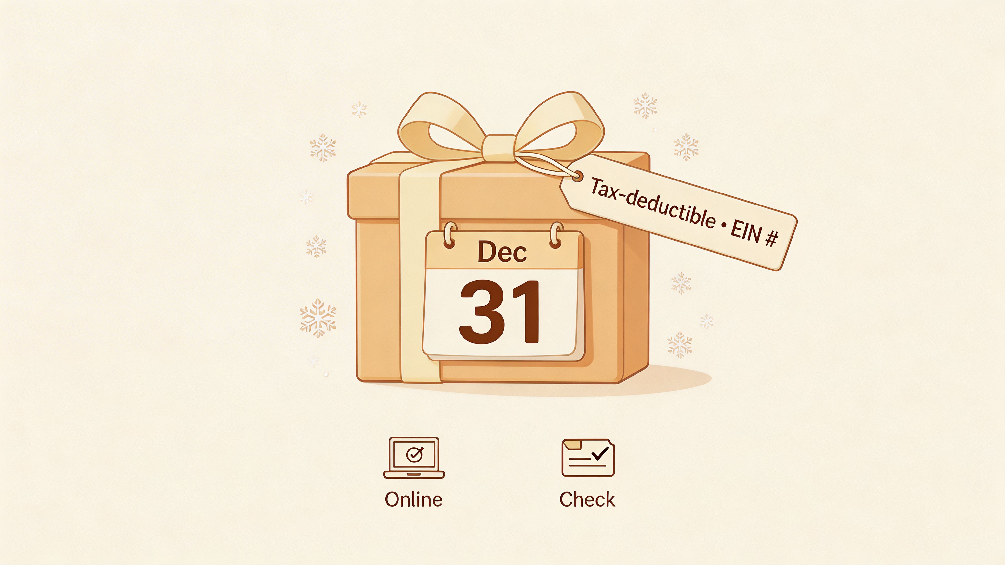
- Top: a clear deadline such as “Give by December 31”
- Middle: one specific outcome the gift supports in January or the next program cycle
- Bottom: EIN, donation URL, QR code, and a real contact for tax or processing questions
Audience matters here too. A print flyer for an event table or front desk should focus on deadline, tax-deductible status, and a simple giving path. A digital version can do more. Add clickable buttons for online gifts, stock transfer instructions, or donor-advised fund recommendations, but keep one primary call to action so the page does not split attention.
This flyer also needs to match your back-end process. If you mention tax deductibility, your receipt language, gift acknowledgment timeline, and finance workflow need to be accurate. If you promote stock or DAF gifts, someone on staff needs to monitor those channels and respond quickly. Year-end trust is operational.
For an environmental nonprofit, the flyer might connect a December gift to land stewardship or winter conservation work already scheduled. For an education nonprofit, it might show how gifts received now support tutoring, meals, or classroom access when students return in January. Specificity helps donors justify the gift to themselves and makes later reporting easier for your team.
Keep the tone practical. Year-end donors want confidence that their gift will be processed on time, receipted correctly, and put to work right away.
5. Volunteer Recruitment and In-Kind Donation Flyer
Some of the most useful fundraiser flyer ideas aren’t asking for cash first. They’re asking people to help in ways that reduce costs, expand capacity, and deepen long-term involvement.
This flyer works for food banks, community centers, arts organizations, and youth programs. It’s valuable when your donor base includes people who want to contribute but aren’t ready for a financial gift.
Ask for real jobs and real goods
Vague volunteer copy fails. “Help our mission” is weak. “Sort pantry donations Tuesday evenings” or “Tutor middle school students on Thursdays” gives people something they can imagine doing.
The same goes for in-kind support. Name the item, the use, and the quantity if you have it. Diapers, hygiene kits, art materials, printing, pro bono legal review, event photography, or van maintenance all make sense when tied to a visible need.
A community development nonprofit may need skilled labor for a neighborhood cleanup. A youth organization may need tutors and school supplies. An arts nonprofit may need donated framing materials or design help. These asks create a broader support funnel than money alone.
This is one of the smartest places to connect fundraising operations with grants. Track volunteer hours, donated services, and item fulfillment carefully. That information strengthens grant reporting and future proposals because it shows community buy-in and efficient operations.
A good flyer here does three things at once:
- Welcomes non-cash supporters: It lowers the barrier to entry.
- Creates specificity: People know what’s needed.
- Builds future donors: Volunteers become advocates, peer fundraisers, and recurring givers later.
The trade-off is administrative. Don’t publish ten volunteer roles if you can only onboard two. A clean signup process and follow-up system matter more than a long list of needs.
6. Crisis or Urgent Need Fundraiser Flyer
At 6:30 a.m., the boiler fails at a shelter during a cold snap, or a food pantry sees demand jump after a local layoff. That is the moment for a crisis flyer. It is not a catch-all format for an ordinary budget shortfall.
Urgent appeals work only when the need is real, specific, and time-bound. If every flyer uses emergency language, donor trust erodes fast. Supporters start treating your messages like background noise, and the next real crisis gets a weaker response.
Build for action first
A crisis flyer has one job. Move the right people to the right response channel quickly.
That changes the design choices. Donors need a fast giving path. Volunteers may need a separate contact method if you are asking for meal prep, transport, or on-site help. Institutional partners and sponsors need enough operational detail to decide whether they can underwrite a discrete cost such as hotel vouchers, generators, or emergency supply kits.
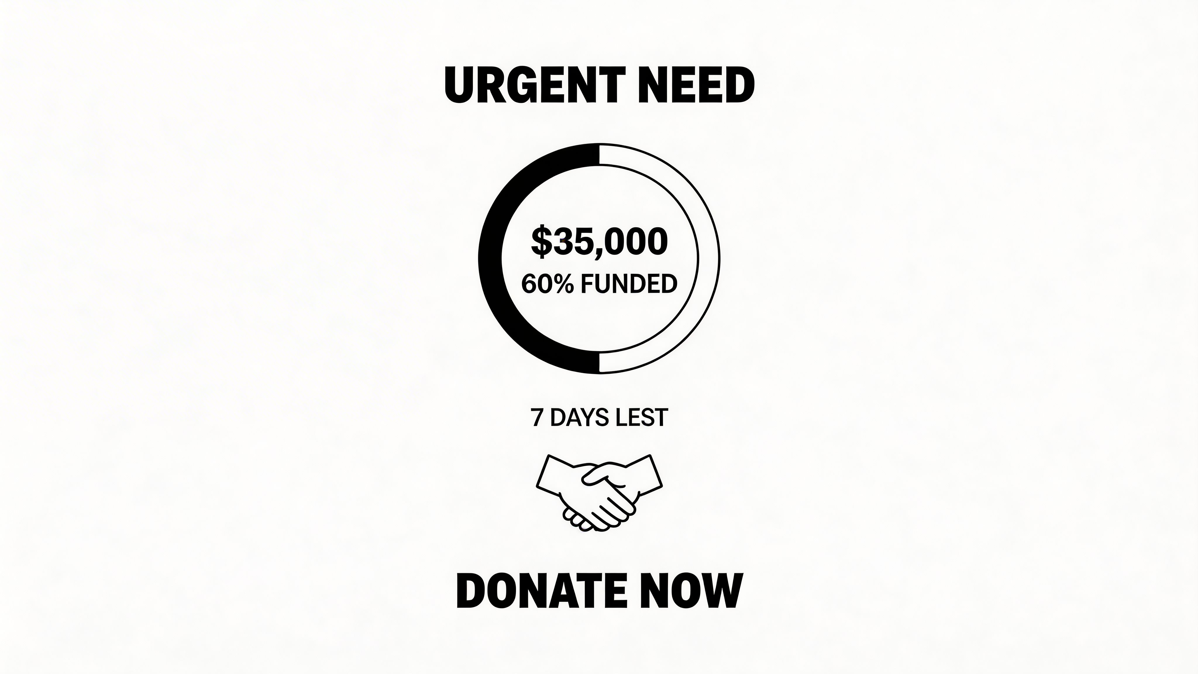
For print, keep the message stripped down. Name the incident, state what will be funded in the next few days, and give one direct action step. For digital distribution, use the same core message but link to a live landing page where totals, deadlines, and needs can be updated without redoing the whole flyer. The QR code should go to the emergency fund page, not your main donation menu.
Good crisis flyer copy usually includes:
- The immediate problem: Emergency shelter overflow, storm damage, broken equipment, transport, or a sudden spike in service demand.
- The next use of funds: What today’s donation pays for first.
- A current timeframe: Tonight, this week, or before a specific repair deadline.
- A reporting promise: When supporters will hear what happened with the funds.
That last point matters more than many teams expect. Crisis appeals create a reporting burden. If you raise money for motel rooms, food boxes, or replacement equipment, track those outputs from the start. The same records that reassure donors also support board updates, grant conversations, and any later restricted-fund reporting.
Use blunt calls to action here because the situation calls for them. “Give now to cover 25 emergency shelter beds” is stronger than broad mission language. Specificity signals control. In a crisis, donors are not just responding to emotion. They are looking for evidence that your team knows what it is doing.
The trade-off is speed versus verification. Get the flyer out quickly, but do not publish numbers, timelines, or supply needs that staff cannot confirm. A short, accurate flyer will outperform a more dramatic one that creates confusion by tomorrow.
7. Peer-to-Peer Fundraiser Network Flyer
Peer-to-peer flyers don’t primarily ask for a gift; they recruit ambassadors.
That makes them useful when your nonprofit has a committed circle of parents, alumni, patients, runners, congregants, or volunteers who tell your story. Instead of asking each person for one donation, you’re equipping them to raise from their own network.
Give supporters a campaign kit, not just inspiration
This flyer should feel like an invitation to lead. Include a simple explanation of how to start a personal campaign, plus the materials they’ll receive. Logos, sample posts, short talking points, event details, and a support contact make the difference between enthusiasm and drop-off.
March-style walks, birthday fundraisers, memorial pages, and school challenge events all fit. A children’s hospital might ask families to launch birthday campaigns. A local nonprofit race might ask team captains to recruit from friends and coworkers.
Dataro notes that predictive metrics such as gift recency, frequency, and average gift size correlate with 20-30% uplift in reactivation when outreach targets high-propensity segments, according to its fundraising analytics guide. Applied, that means your peer-to-peer flyer shouldn’t initially go to everyone. Start with the people already most likely to act as advocates.
Strong flyer language for this format includes:
- A clear role: Start a page, join a team, host a mini fundraiser
- A support promise: We’ll give you ready-made materials
- A shared outcome: Your network helps fund one visible mission result
What doesn’t work is assuming supporters know how to fundraise. Most don’t. They need framing, examples, and permission to keep it simple.
8. Board Member Insider Giving Flyer
The campaign calendar is set. The case for support is written. Before the first public email goes out, board members need their own version of the ask.
That is the job of an insider giving flyer. It gives leadership a clear, usable tool for an internal phase of fundraising that is often handled too casually. Use it with board members, senior staff, campaign cabinet members, founding families, and advisory leaders. The point is straightforward. People closest to the mission should understand the goal, make their own commitment, and be ready to speak about it with confidence.
This piece needs more than a meeting reminder. It should spell out the campaign target, the participation goal, giving options, and the specific result leadership gifts help fund. For some organizations, that means 100 percent board participation before a gala sponsorship push. For others, it means securing early pledges that can be referenced in a grant report, donor meeting, or annual campaign launch.
The design should support discretion and clarity. Keep the layout polished, but not flashy. Include a short message from the board chair or executive director, a giving range or “give meaningfully” standard, payment timing, and a deadline tied to the public rollout. If your organization is still defining what board service includes, this guide to nonprofit board member responsibilities helps frame the expectation appropriately.
Audience matters here. A flyer for board members can be direct about participation and leadership example. A version for senior staff usually needs more context around voluntary giving and payroll or recurring options. A version for advisory councils may focus less on obligation and more on influence, visibility, and campaign momentum. One flyer concept rarely fits all three groups without revision.
Format matters too. Print works well in board packets and campaign retreat folders, where people may discuss the ask together. A digital version is better for follow-up because it can link to a pledge form, recurring gift setup, and contact information for confidential questions. Strong organizations use both. The flyer starts the conversation, then the backend process makes it easy to complete the gift and track participation accurately.
The external value is credibility. When leadership participation is documented early, development staff can speak more confidently with sponsors, major donors, and even grantmakers about internal commitment. A strong insider flyer does not just ask for money. It prepares your closest stakeholders to model the campaign you are about to bring to everyone else.
9. Planned Giving Legacy Donor Flyer
Planned giving flyers need a different pace. They shouldn’t feel like campaign posters. They should feel calm, respectful, and durable.
This is a longer-form flyer or one-page handout for mature donors, long-time supporters, and households that care about lasting impact. The purpose isn’t to close a complex gift on the spot. It’s to open the conversation.
Use restraint and credibility
Legacy donors want seriousness. Clean design, readable type, and plain explanations beat flashy graphics. Explain that supporters can include your organization in estate plans, beneficiary designations, or other long-term arrangements, then invite them to talk with their advisor.
This is not the place for hard-sell language. It is the place for trust markers. Givebutter’s research on fundraising goal trackers notes that 72% of donors are more likely to give when charity rating badges are present, according to its goal tracker article. While that article focuses on campaign visuals, the lesson applies here too. Legacy prospects look for signals that your organization is stable, transparent, and responsible.
A museum, congregation, university, or healthcare nonprofit can use this flyer at donor events, mailings, or stewardship meetings. A legacy society name can help, but only if the recognition feels sincere rather than exclusive for its own sake.
Good content choices include:
- A simple explanation of legacy options: broad, not legalistic
- One donor story or rationale: why someone chose to leave a gift
- A next step: contact your development director, request an information packet, or attend an educational session
This flyer should not try to do tax or legal advising. It should open the door and let a real advisor finish the work.
10. Equity and Access-Centered Fundraising Flyer
A parent sees your flyer at pickup, wants to help, and puts it back down because the only call to action is a QR code, the text is dense, and the donation language assumes a credit card gift. That is not a design problem alone. It is a fundraising strategy problem.
An equity and access-centered flyer is built for supporters who participate in different ways and on different terms. It gives donors, volunteers, neighbors, and in-kind supporters clear options without implying that one kind of contribution matters more than another.
Start with access choices that match how your community responds. Offer a digital gift path, but also name offline options such as cash at the office, a mailed check, supply donations, or a volunteer contact. For multilingual audiences, separate translated versions usually work better than squeezing several languages into one crowded layout. The result is easier to read, easier to share, and easier to track by audience segment.
That tracking matters.
If you distribute one version at a food pantry, another through a school partner, and a digital version through text or email, your team can see which audience responds to which ask. That helps with more than campaign performance. It improves follow-up, board reporting, and grant reporting because you can show who engaged, how they gave, and whether your outreach matched the community you said you wanted to reach.
Design choices should support that strategy. Use larger type, high contrast, short copy blocks, plain language, and one clear action per response path. If someone can give $5, volunteer for two hours, donate bus passes, or share the flyer with family, say so directly.
A Givebutter analysis of multiple studies found that hybrid print and digital outreach, QR code usage, and tested flyer variations can improve engagement compared with relying on a static flyer alone. For this kind of campaign, the practical takeaway is simple. Keep the flyer usable for someone who wants to scan and give in seconds, and just as usable for someone who needs an offline option.
A neighborhood arts program, immigrant-serving nonprofit, or community health organization can get strong results from this format because it treats access as part of donor experience, not as an afterthought. The best version removes friction, preserves dignity, and gives your staff cleaner data on what support looks like in your community.
10-Point Comparison: Fundraiser Flyer Ideas
| Flyer Type | Implementation Complexity 🔄 | Resource Requirements ⚡ | Expected Outcomes ⭐📊 | Ideal Use Cases 📊 | Key Advantages ⭐ | Quick Tips 💡 |
|---|---|---|---|---|---|---|
| Matching Gift Challenge Flyer | Medium 🔄 (needs partner agreement and deadline coordination) | Moderate (sponsor coordination, marketing assets, tracking) | High ⭐ (increases donation frequency and average gift size) | Campaign windows, grant-matching periods, year-end pushes | Doubles perceived impact; adds corporate credibility | Confirm match before launch; use progress thermometers |
| Program-Specific Impact Flyer | Moderate 🔄 (requires accurate data and consented stories) | Moderate (photos, impact metrics, design) | High ⭐ (demonstrates ROI and supports grant narratives) | Major donor cultivation, grant proposals, program launches | Shows accountability and concrete outcomes | Use specific stats; secure releases; link to full reports |
| Event Sponsorship Opportunity Flyer | High 🔄 (ties to event logistics and sponsor benefits) | High (sales outreach, sponsorship packages, event planning) | Moderate–High ⭐ (diversified revenue; corporate relationships) | Galas, walkathons, conferences seeking sponsors | Creates new revenue streams and visibility for sponsors | List tier benefits clearly; set early sponsor deadlines |
| Year-End Giving / Tax Deduction Flyer | Low–Moderate 🔄 (time-sensitive messaging and accuracy) | Moderate (multichannel assets, tax verification) | High ⭐ (drives a large share of annual revenue via urgency) | November–December appeals; tax-year donors | Tax incentives boost gift size; urgency prompts action | Launch by mid-Nov; include EIN; offer multiple formats |
| Volunteer & In‑Kind Donation Flyer | Moderate 🔄 (requires role clarity and intake logistics) | Low–Moderate (sign-up systems, training, donation handling) | Moderate ⭐ (reduces costs and grows supporter base) | Organizations needing labor, supplies, pro bono services | Lowers operational costs; builds community advocates | Define roles/quantities; track hours; recognize volunteers |
| Crisis / Urgent Need Fundraiser Flyer | High 🔄 (rapid production and strict accountability) | High (real-time updates, payment channels, PR support) | High ⭐⚡ (fast large donations and media attention) | Disaster relief, emergency shelter, urgent organizational needs | Rapid mobilization and high visibility | Use sparingly; state exact needs; enable one-click giving |
| Peer‑to‑Peer / Fundraiser Network Flyer | High 🔄 (infrastructure and continuous support needed) | High (toolkits, platform integrations, staff support) | High ⭐ (expanded reach and new donor acquisition) | Community fundraisers, walks, personal campaigns | Exponential reach via trusted networks | Provide campaign kits; set realistic goals; offer recognition |
| Board Member / Insider Giving Flyer | Low–Moderate 🔄 (internal policy clarity and communication) | Low (targeted materials, tracking/reporting tools) | High ⭐ (strengthens grant credibility and models giving) | Board drives, annual reporting, grant applications | Signals organizational credibility to funders | Distinguish expectations vs requirements; offer payment plans |
| Planned Giving / Legacy Donor Flyer | High 🔄 (long sales cycle and professional stewardship) | High (trained staff/consultants, legal/referral resources) | High ⭐ (long-term) (large lifetime gifts and revenue stability) | Cultivating HNW donors, endowment building, legacy programs | Generates lasting, substantial gifts and loyalty | Use professional tone; avoid legal advice; host educational events |
| Equity & Access‑Centered Fundraising Flyer | Moderate 🔄 (inclusive design and accessible messaging) | Moderate (translations, multiple payment methods, outreach) | Moderate–High ⭐ (broadens donor base and recurring small gifts) | Community-focused, social justice, inclusive campaigns | Democratizes fundraising and builds sustained support | Design for accessibility; accept varied payments; celebrate small gifts |
From Idea to Impact Activating Your Next Campaign
A flyer can be small and still carry a lot of strategy. That’s the main shift nonprofits need to make. Stop treating the flyer as the final design task and start treating it as a campaign asset with a job to do.
The right format depends on the moment. A matching challenge flyer creates urgency around a short window. A program-specific flyer helps a donor understand one clear outcome. A sponsorship flyer gives businesses a fast decision document. A volunteer and in-kind flyer widens the circle of support when cash isn’t the only resource your organization needs. A crisis flyer speeds response, but only if the urgency is real. A legacy flyer opens a very different kind of conversation and needs a calmer tone.
That strategic match between audience and purpose is what separates effective fundraiser flyer ideas from generic nonprofit collateral. The flyer for a board campaign shouldn’t sound like the flyer for a neighborhood donation drive. The version posted at a clinic shouldn’t mirror the one emailed to sponsors. When teams respect those differences, response quality improves because the message makes sense for the person reading it.
Backend systems matter more than many organizations expect. If your flyer promises impact, you need the data to support it. If it asks volunteers to sign up, someone needs to follow up quickly. If it directs donors to a QR code, the landing page has to match the promise on the page. If it highlights a program, your grant narratives and public fundraising language should reinforce the same story. That consistency builds trust.
The strongest nonprofits use the same discipline in fundraising materials that they use in grant writing. They track outcomes, define who the support helps, and explain what resources make possible. Public-facing flyers and funder-facing reports don’t have to sound identical, but they should point to the same reality. That makes your organization easier to understand and easier to believe in.
If you’re refining your next campaign, build the flyer after you answer three questions. Who is this for? What action should they take? What proof will make that action feel worth it? Once those answers are clear, the design gets simpler, the writing gets sharper, and the flyer starts doing real work.
For teams promoting an event alongside the flyer itself, a strong sample press release for a charity donation event can help reinforce the same campaign message across channels.
If your team wants flyers, grant proposals, and funder reporting to tell one consistent story, Fundsprout can help. It gives nonprofits a ranked funding pipeline, automated eligibility screening, an RFP analyzer, writing support grounded in your documents and impact data, and planning tools that keep deadlines visible. That means your public fundraising materials can draw from the same real program evidence you use to win grants and report results.
Try 14 days free
Get started with Fundsprout so you can focus on what really matters.